One of the reasons I started Web + Flo is because of all the confident (but poor) advice being preached to eCom Founders.
“change this button colour for 50% more sales”.
“your homepage is THE most important page on your site”
“make it more fun and bouncy”
If only it was that easy hey? I’d be a millionaire, soaking up the good life in Rio
So what does move the needle you ask?
Here are the site changes that I’ve seen have the biggest impact on sales and revenue
My 3 website non-negotiables fall under :
1. The First 5 Seconds Test (Hero Section Clarity)
Knowing what you offer, who you help and why someone should choose you over a competitor needs to be clear in an instant.
Our attention is all over the shop and you’ve spent so much effort and even money getting them to your site. Make an incredible impression
Here’s how:
Start with a strong headline - steeped in data and research from all your lovely customers
Pair it with an emotive image or video that clearly aligns with your messaging
Build trust early. It could be awards, publications, reviews or a testimonial
Nail the CTA - Shop Now is not the only copy.
Be descriptive. “Browse the X Range” “Meet our new X”.

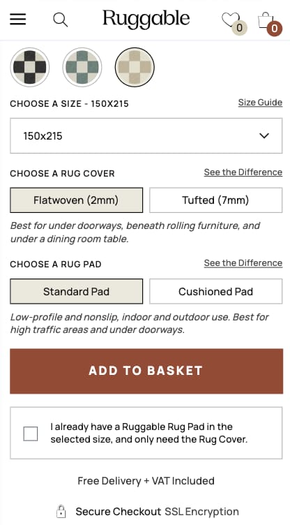
2. Upgrade Your Product Pages (for clarity & trust)
Showcasing your value is the aim of the game here.
As a luxe brand with higher price points. It is not enough to hope a few lovely pictures will justify the costs
Here’s what to do:
High-quality, fast-loading images, videos and even gifs
Show product in action (lifestyle & UGC-style shots).
Does it actually work? Show the making of it and therefore the value
Address motivations and objections upfront
I create a map of all of the hesitations and motivators someone might have about your product. Answer these in your gallery or on the page
An example might be which room will this suit? How does it arrive?
Please don’t hide the delivery costs
Don’t assume. Be clear as day
We’re all awful at reading these days - scanning and skimming is how we roll on sites so use design to draw attention to key info.

3. Mobile-optimised journeys
Most website builders prioritise the desktop view.
It puts you on the backfoot when reviewing the site so I get it.
But make a conscious effort to review on your phone.
Look at your device traffic split - I don’t need to say anything else about this

OVER TO YOU
Make a note of the date and actions you make.
That way you can learn what’s working and what isn’t
A website is never done.
Nurture it and watch it grow like a beautiful spring daffodil
Or get frustrated af. Hand it over to a conversion-first to make the recommendations for you.
Book a call, I’d love to help
ON MY RADAR
Product Launching in 2025
The old way: build a great product - run some ads - people will buy
The new way: build hype within a community - share the whole journey with little mention of the product - ready and waiting buyers
Sult: a content-first approach. Sharing the highs and lows of building an electrolyte brand
Sleep or Die: the sleep challenger
It’s a really tough but exciting to be in eCom
Adapt, follow my advice… or die
Laura


